If there is one thing Erika Woelfel knows, it’s color.
For 20 years she’s been playing with color and building palettes, in graphic design, merchandising, color consulting, and for the last eight years, as the Vice President of Color and Creative Services at BEHR Paint.
She and her team design everything from the color card at the store and the home sets where the colors are showcased, to the actual paint colors you use, often test driving those colors in their own homes.
(Right now BEHR’s Polished Aqua lives in Woelfel’s kitchen where it’s paired with white cabinetry and earthtone granite surfaces.)

Erika Woelfel Vice President of Color and Creative Services at BEHR Paint
BEHR recently released it’s color forecast for 2017 and when we saw the colors, the Vetrazzo team went right into color matching mode. We can’t resist a new color! So we asked Woelfel to give us her top five color matches for some of our top selling surfaces, plus some background on how she spots color trends.
How did she feel about working with a high color surface like Vetrazzo?
“There’s so much flexibility with these countertops,” Woelfel said. “I love the versatility. When you have fashion forward countertops, they become the hero of the room. You can draw so much from them, whether you go with a monochromatic color for a more relaxed, sophisticated look or a contrasting color for an accent wall.”
“It’s a partnership,” Woelfel said, about the relationship between the color of the surfaces and the walls. “With statement countertops like recycled glass, the color of the walls becomes the background, pulling the room together. Paint is also an economical way to update the space over time.” A new paint color, she said, allows you to stay on trend while decorating around the “drama point” of your space.
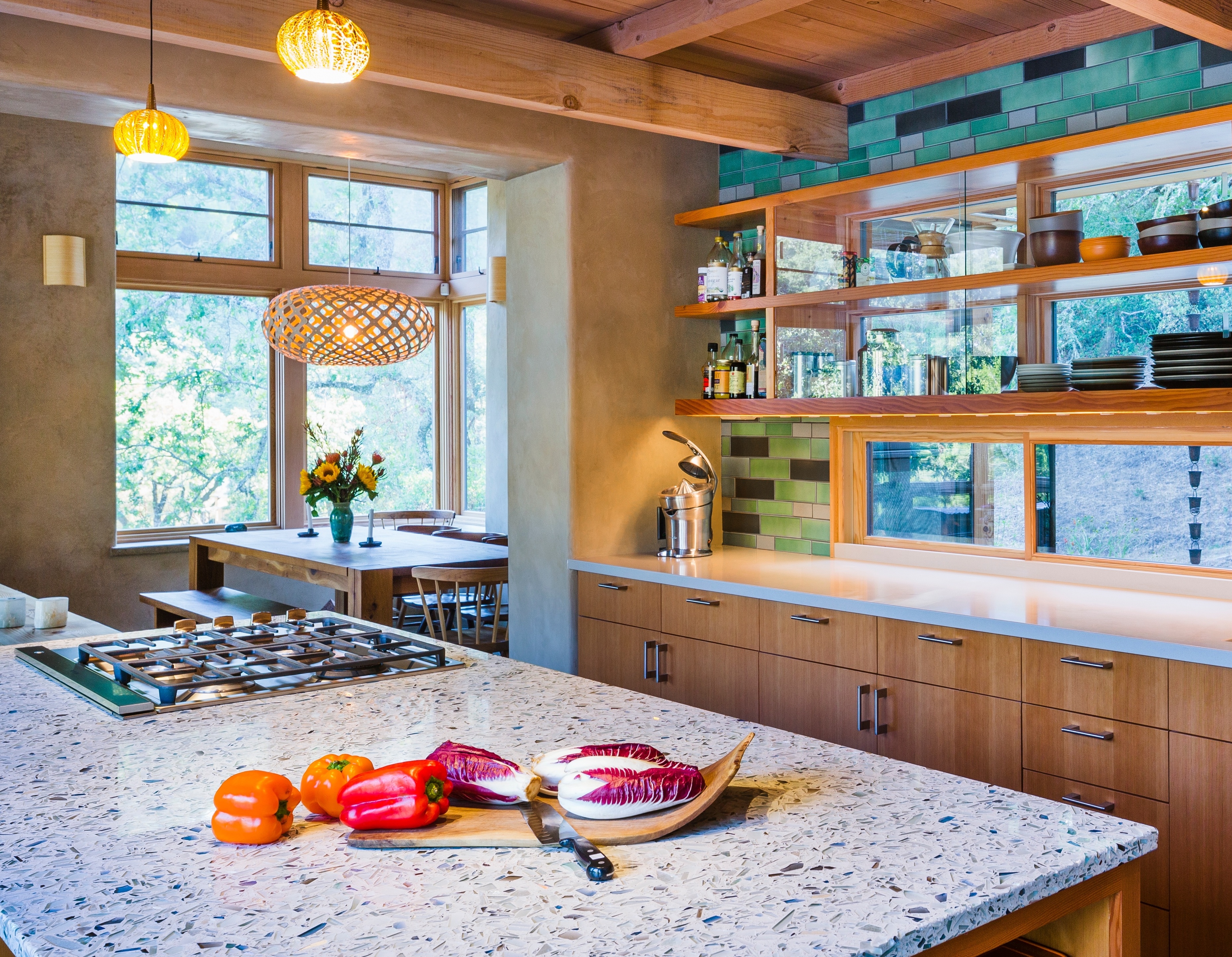
Vetrazzo recycled glass surfaces are all about color. Our customers love colors both bold and subtle, and tend to design their space around the glass color. See more of this winning kitchen from our Design Star contest.
Here’s more from our interview with BEHR’s VP of Color and Creative Services:
How do you approach forecasting color? What markets or industries do you look to for color trends?
The inspiration behind our yearly color forecasts, and the popular hues that arise in between, come from a surprising array of sources—from art to technology, food to travel and what we see happening on the runway. To help narrow this overwhelming array of options, BEHR has a very talented team of colors experts.
Every year our color team researches and develops the hues and themes that form the trends. We’re avid note takers, drawing inspiration from everyday life, retail excursions, home décor trade shows, fashion, global travel, and other industries like transportation, communications and even tech.
As a result, the final color trend collection is influenced by a variety of sources. The goal is to provide new color options that are easy to use and allow creative expression. That’s what makes color so much fun!
What do you see the grey trend transitioning to?
Grey has been a macro trend for five years or more and it’s peaked. We’re starting to see a move into taupe, a little bit warmer, and I think that means it’s time to start transitioning into browns again. Recently I saw that FitBit is coming out with a new band in a rusty brown color and I thought, We haven’t seen this before. I’m seeing brown in more and more of the palettes of esteemed color forecasters. We haven’t seen that since the 1990s. There is a new generation of DIYers and remodelers out there who haven’t seen brown before. It’s new to them.
What advice would you give a homeowner or designer on pairing paint color with such vibrant surfaces?
Choosing a paint color that complements your countertop or wall tiles can help bring attention to the dazzling details of these glass surfaces. Start by studying the flecks of color mixed into the glass, and picking up BEHR paint swatches (available at The Home Depot) that match these accent hues to really make them shine. Don’t feel the need to match the paint to the glass perfectly – choosing a shade that is slightly lighter or darker can add interest and help you evoke a specific mood. For example, BEHR’s Echo Park MQ6-10 would bring out the grey-green speckles in Vetrazzo’s Emerald Coast and add depth, while BEHR’s Pumice MQ6-23 would pair nicely with darker surfaces like Ruby Red.
Match up
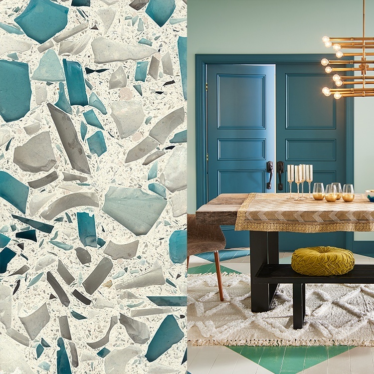
Floating Blue/Polished Aqua
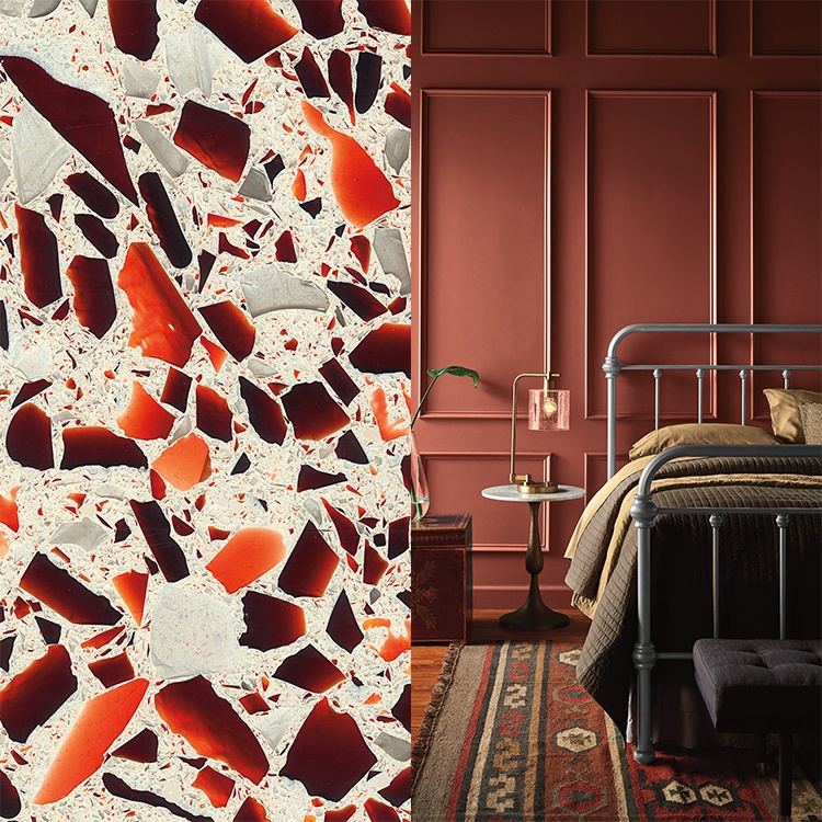
Ruby Red/Hot and Spicy
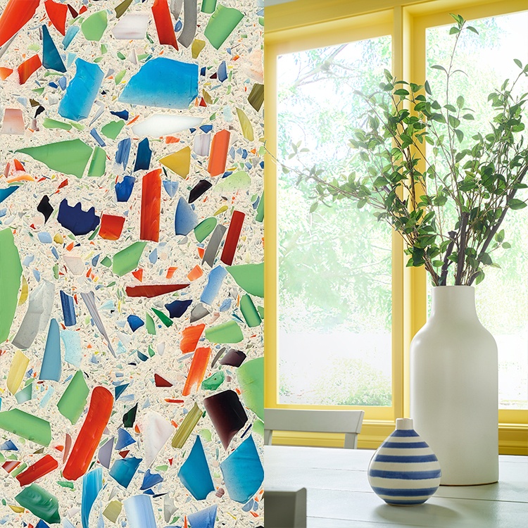
Millifiori/Lemon Burst
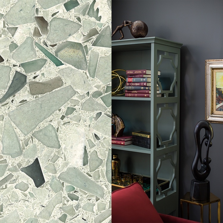
Cubist Clear/Close Knit
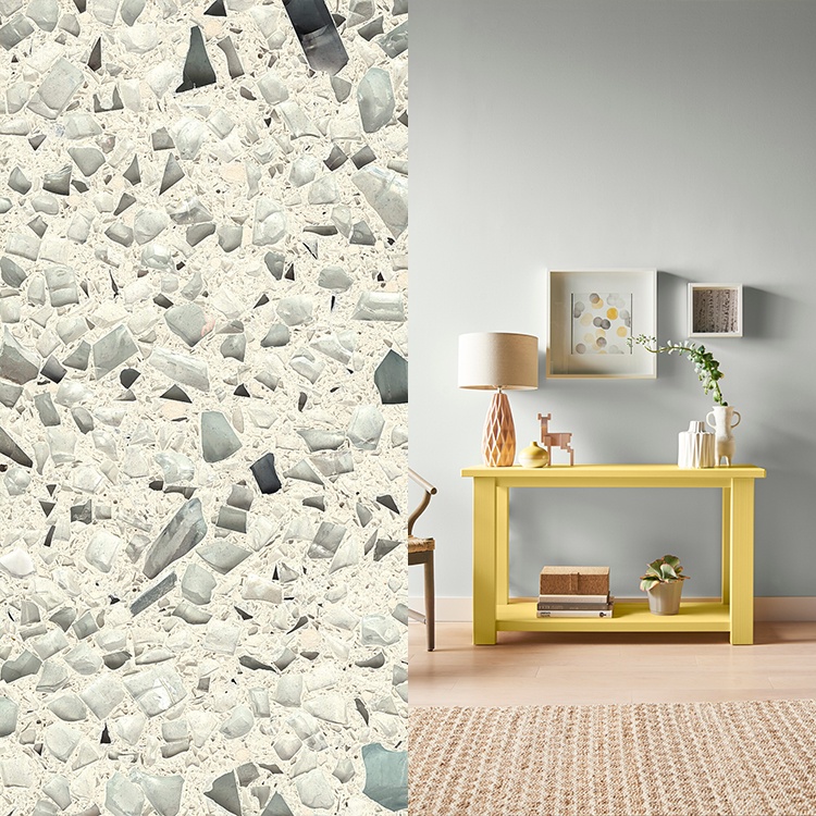
Palladian Gray/In The Woods
Colors
Floating Blue
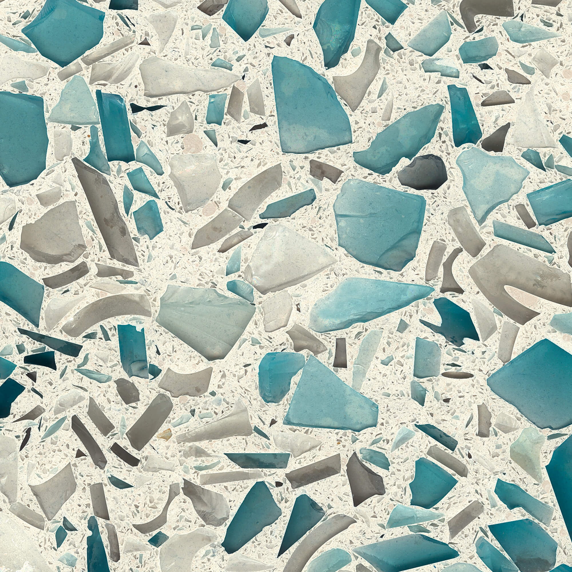
Glass source
Demolition architectural glass, inspired by sea glass
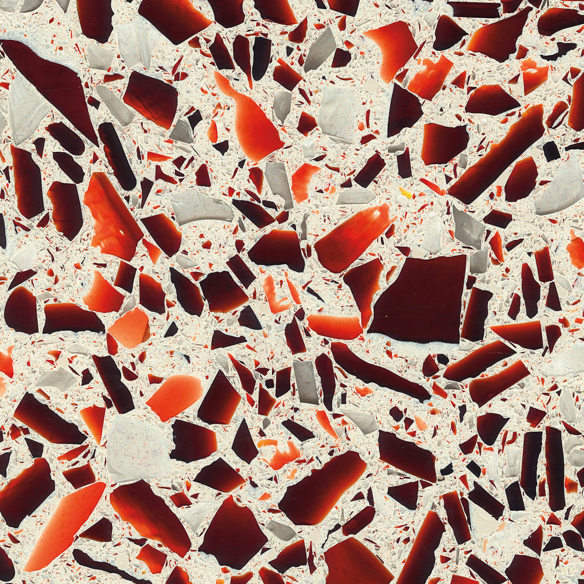
RUBY RED
Glass source
Clear glass condiment jars, red glass from stained glass windows and dishes.
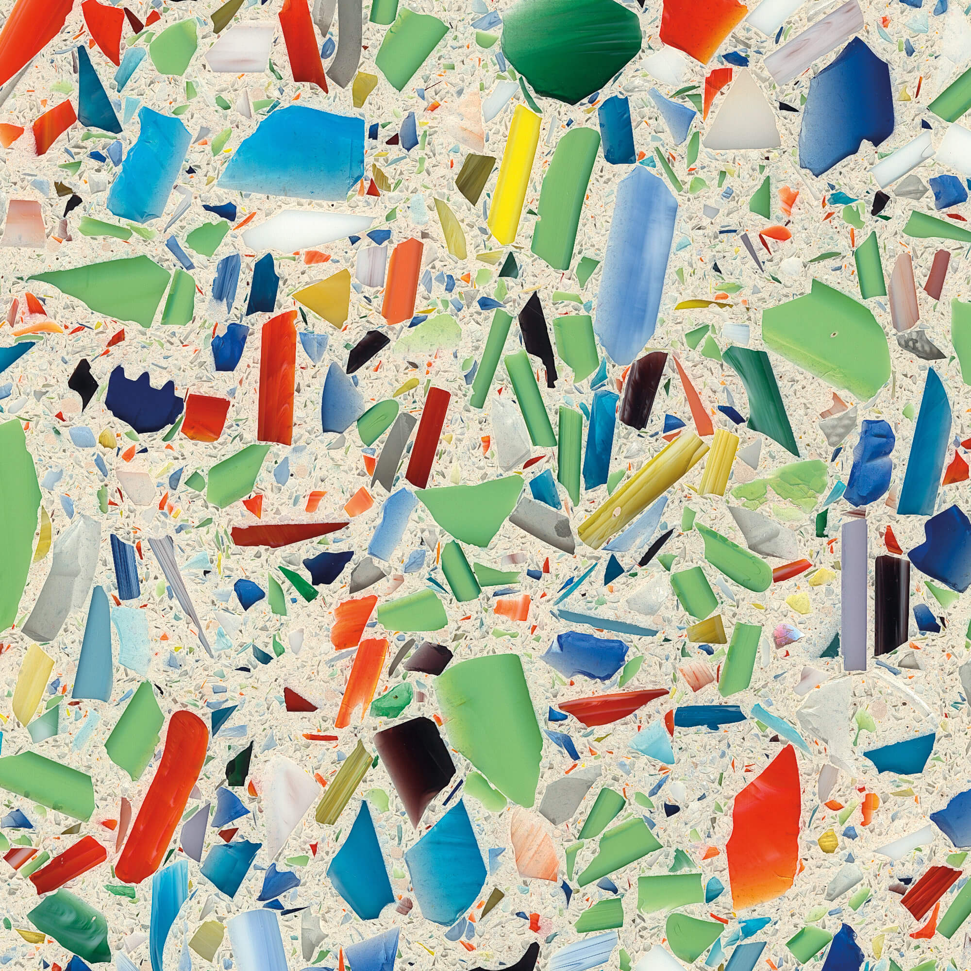
MILLEFIORI
GLASS SOURCE
Stained glass shards in 12 different colors
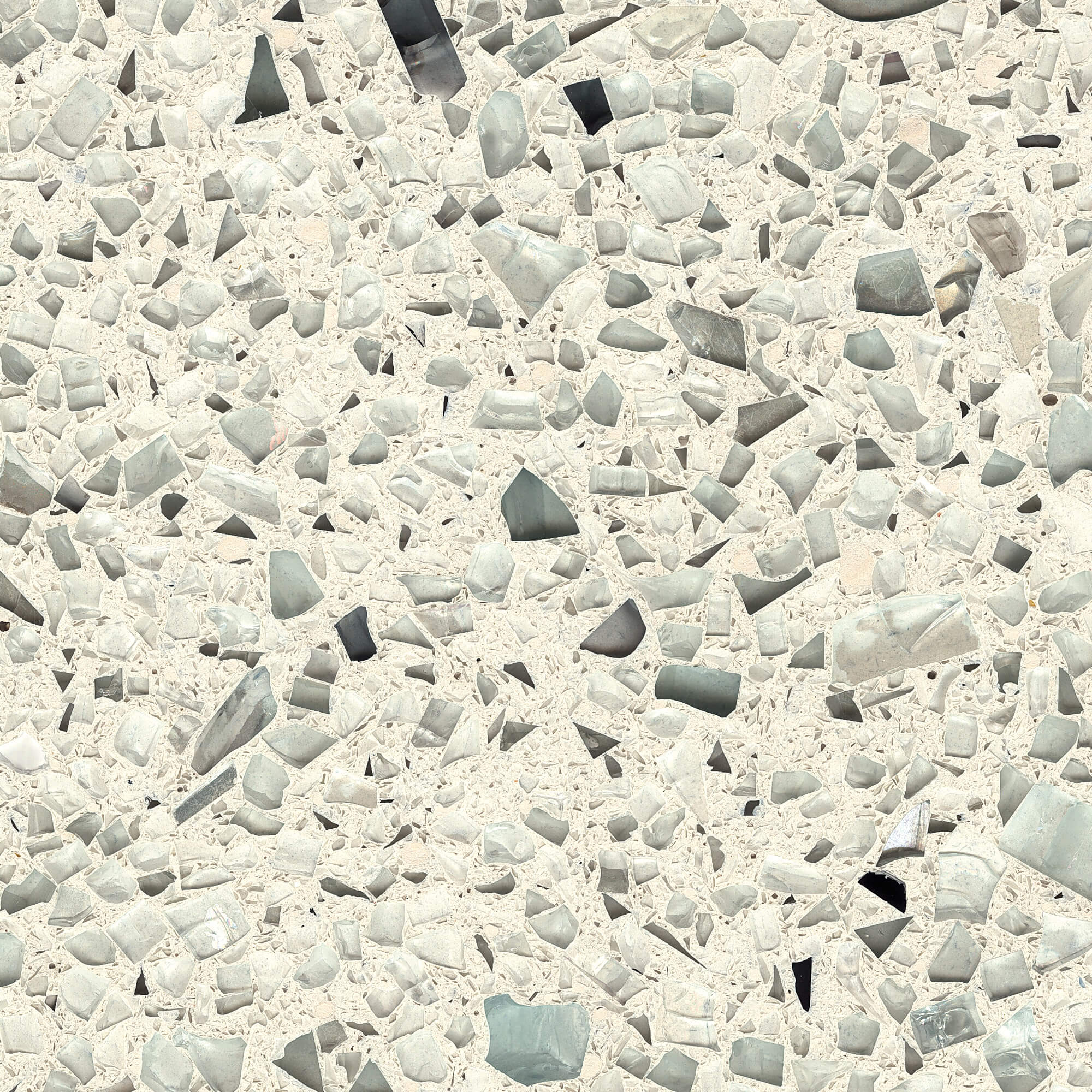
CUBIST CLEAR
GLASS SOURCE
Tempered glass
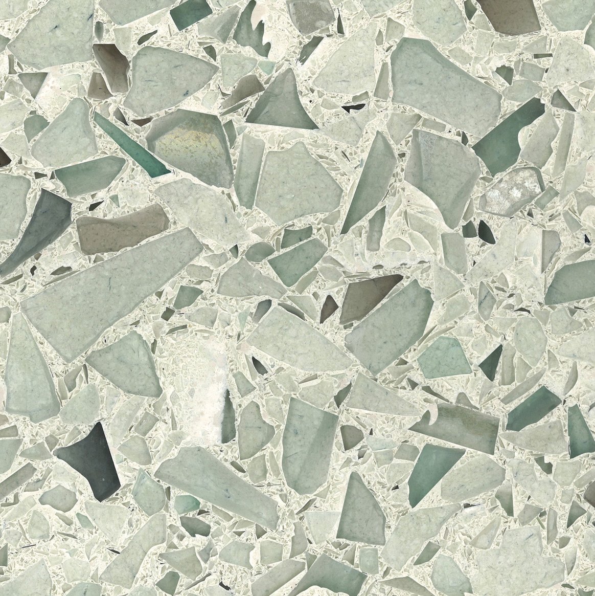
PALLADIAN GRAY
GLASS SOURCE
Demolition architectural glass and aquariums
Want to dive into some more color inspiration? Samples are free to the trade. Order yours here.