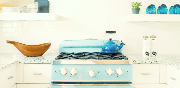
Although neutrals and greys may have been receiving a lot of attention in color trends lately, images of gleaming all-white kitchens and interiors continue to pervade the pages of design publications and more products are offering their own 50 shades of white. The thought of having one of these pristine, picture-perfect kitchens is enough to make most homeowners glaze over with envy, or for others it may make their skin crawl with all that nerve-wracking perfection just waiting for the kids to come home from school and break out their latest snack concoction. But what about those of us who harbor our own guilty pleasure of incorporating pops of color into our lives while embracing some of that bright aesthetic, are we doomed to suffer at the hands of these white-washers and fade into starkness, how do we add some life to a sterile palette?
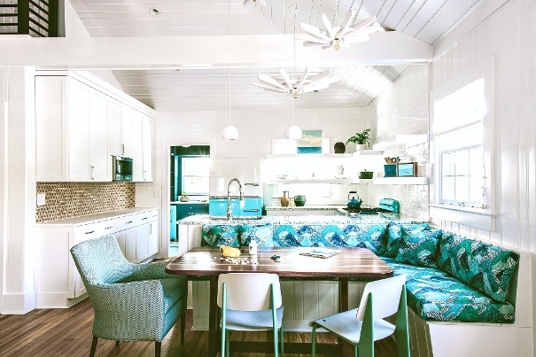
One way to break out of this numbing mold can be found in this South Carolina shore home recently featured in Coastal Living Magazine, located only one block from the beach on Sullivan’s Island that combines a range of textures and colors to create a laid-back, inviting atmosphere made for entertaining guests. The retro-style 1,500 s.f. bungalow was full of coastal charm, inviting sandy feet right off the beach, but was also cramped and confined. Instead of demolishing the home and building a ‘McMansion’, Beasly Custom Builders was tasked with managing a renovation to change the floor-plan in order to accommodate a large family out of Virginia, maintaining the roots of the home and neighborhood while at the same time updating the layout and finishes. As Cortney Bishop of Cortney Bishop Design says, “Originally there were low ceilings and an attic. We opened up the ceiling and combined the living room and kitchen to create a great room with a pitched ceiling”.
Early on in the design process the decision was made to incorporate a palette of blue into the scheme to embrace a beachy lifestyle. . “It’s a place where everyone can relax. Its retro vibe makes it unique to other beach houses in the area, and its cozy small size,” Bishop says. In particular, shades of turquoise and cobalt blue played a prominent role, especially when it came to the kitchen, setting the tone for the rest of the home and tying together interesting patterns, using white more as a unifying theme in the background like a blank canvas. The contractor built a custom banquette next to the kitchen for an informal dining experience. The saturated color accents in the cushions of the built-in seating along with the Big Chill range oven and fridge, and most prominently the Vetrazzo kitchen counters, bring a refreshing vibrancy to the home’s seashore ambiance.
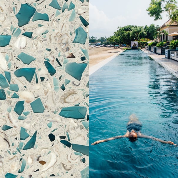
Vetrazzo Bretagne Blue
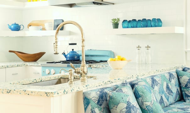
The glass kitchen countertops were made with Vetrazzo Bretagne Blue, “selected for its aesthetics and turquoise glass with large shimmering shards that reflected light like glistening sparkles on the ocean’s waves,” Bishop says. The Bretagne Blue, supplied by AGM Imports and fabricated by Palmetto Surfacing of Charleston, is a unique sea-inspired color from the Coastal Collection featuring a stunning blend of tourmaline-colored recycled glass sourced from architectural salvage, oyster shells from the Carolina coast and pieces of white marble from the local Polycor Georgia marble quarry. Set against the white cabinetry and subway tile backsplash, the colors are balanced and really pop, visually keeping the eye moving while not being too loud. Adding styled pieces of well-placed beach décor throughout the kitchen, especially in the open shelving with the blue glassware, teapot and kettle, make the perfect accents to the recycled glass countertops and polish off the design.
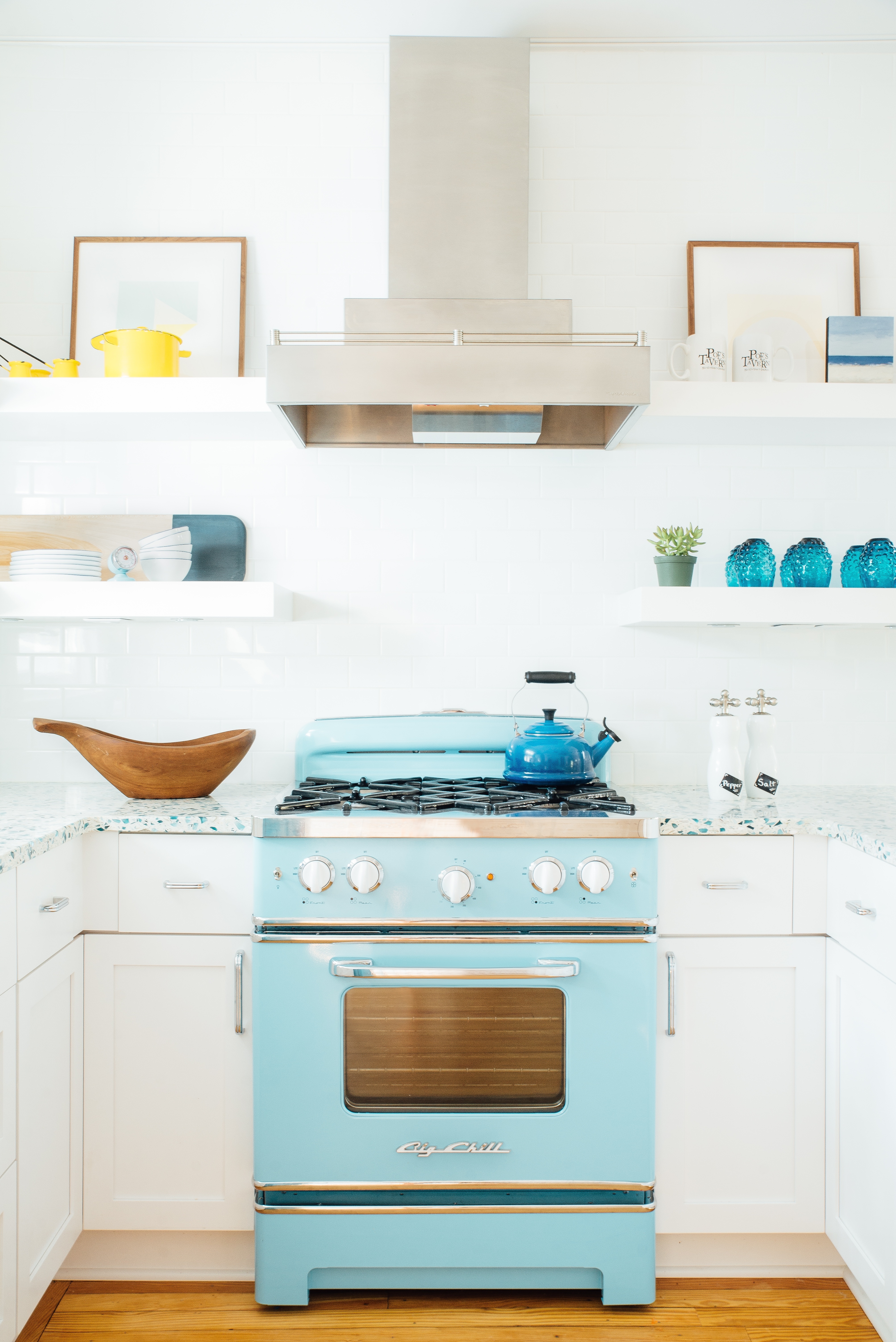
One of the most challenging aspects of the project was the pitched ceiling in the kitchen. To combat the busyness of the support beam and the angles of the hip roof, it was decided to use shiplap woodwork on the ceiling and carry it down the walls, painting everything white here so it would blend well together. Also, to tie in the warm tones of the natural wood floor, a wood backsplash was selected for the left side of the kitchen. Marble was chosen for the counters in this location as a compliment to the backslash, while also working well with the white background in the Bretagne Blue glass countertops adjacent to it. The final effect is flawless and the typically difficult design challenge of combining various materials gives the appearance of being done with ease, seamlessly.
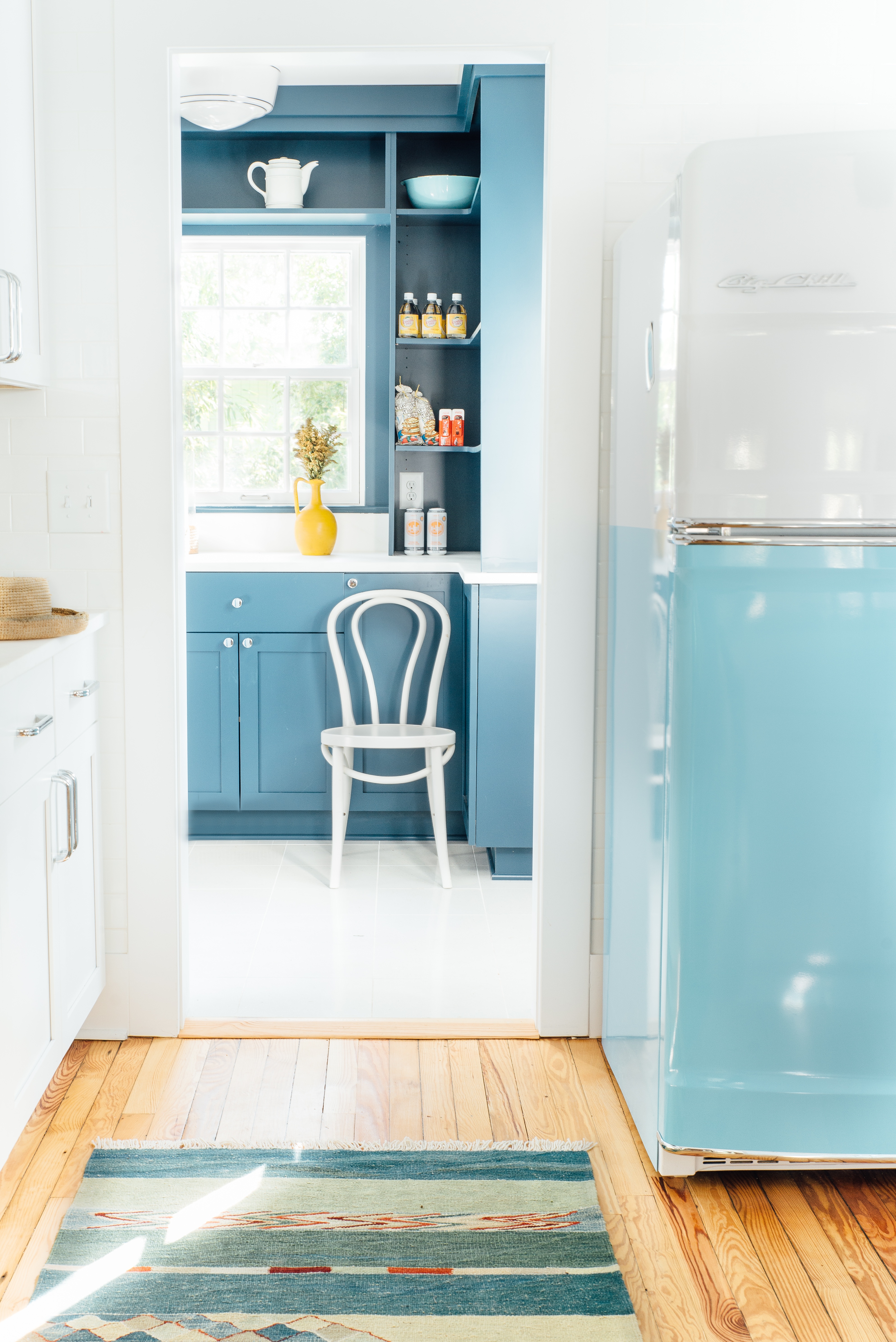
Using key areas to highlight colors in a kitchen design like those shown here will allow you to enjoy your space for years to come and keep you from growing tired of that all-white design, and it will also offer opportunities to change up some of the décor and accessories over time as your mood dictates. Incorporating Vetrazzo’s glass counters into the design will provide an anchor to the rest of the selections and will become the focal point of the overall space. Don’t be afraid to bring in some of your personality through a smart use of color, you won’t regret it.
Looking for color swatches for an upcoming project?
Photography by Amanda Greeley


