BEHR’s Color of the Year: In the Moment T18-15 is a nature-inspired, soul-soothing hue that brings the outdoors in. A cool, tranquil, spruce blue (blue, gray and lush green combo), In The Moment is meant to create a soothing atmosphere within the home.
![Screenshot202017-09-2520at2012.52.2120PM[1]](https://static.hsstatic.net/BlogImporterAssetsUI/ex/missing-image.png)
With this hue on the wall, you may feel less stressed, more comfortable, and become more mindful. It’s meant to turn any space into a personal sanctuary where you can take a break and recharge from the hustle and bustle of life. Clearly the name of the color speaks for itself.
"In The Moment speaks to our society's desire to disconnect and be present," said Erika Woelfel, BEHR’s Vice President of Color and Creative Services.
Last year we interviewed Woelfel about BEHR’s color forecast for 2017. She and her team design everything from the color card at the store and the home sets where the colors are showcased, to the actual paint colors you use, often test driving those colors in their own homes.
This color Woelfel says, “crosses multiple design styles—global, coastal, modern—and pairs well with other subdued colors to create harmony for interiors or exteriors."
In addition to the Color Of The Year, Behr has also released the 2018 Color Trends Palette filled with 20 cool hues predicted to influence décor and design in the coming year. The palette ranges from warm neutrals to daring reds and oranges.
While perusing the Behr Color Trends 2018 inspiration book, we were inspired to match up six Vetrazzo surfaces with interiors using the Color Of The Year: In the Moment.
See which one is your favorite.
MATCH UP
![Behr20Aqua20Current20(1)[1]](https://blog.vetrazzo.com/hs-fs/hubfs/Imported_Blog_Media/Behr20Aqua20Current20(1)%5B1%5D-1.jpg?width=640&name=Behr20Aqua20Current20(1)%5B1%5D-1.jpg)
Growing up fishing, surfing and diving in the waters off the Treasure Coast of south Florida there’s certain colors that become naturally ingrained in the memory banks. I have a general affinity towards blues and greens and when I first saw In The Moment I was immediately immersed in its balanced blend of both colors as well as it’s value, not being too light or too dark. It struck me as an uplifting color that was fresh and invigorating, reminding me of the watercolor shades found in the shallow sandbars of the Atlantic Ocean.
Aqua Current is a soothing combination of seafoam green, aqua, white and sparkling mirrored glass. When we saw In The Moment, we immediately thought of Aqua Current. Pairing with silver accents and crisp, whites shades creates a look inspired by the mid-century modern coastal designs of the 1960s.
![Behr20Fair20Pearl[1]](https://blog.vetrazzo.com/hs-fs/hubfs/Imported_Blog_Media/Behr20Fair20Pearl%5B1%5D.jpg?width=640&name=Behr20Fair20Pearl%5B1%5D.jpg)
Fair Pearl is a unique blend of neutral and blush shades with a pearly iridescence, crafted from recycled glass and mother-of-pearl. When we saw how fittingly the peach, orange and gray colored throw pillows looked against the hue in this sun-bathed reading nook, we knew Fair Pearl would match beautifully.
![Behr20Emerald20Coast[1]](https://blog.vetrazzo.com/hs-fs/hubfs/Imported_Blog_Media/Behr20Emerald20Coast%5B1%5D.jpg?width=640&name=Behr20Emerald20Coast%5B1%5D.jpg)
Emerald Coast was inspired by the glassy green sea of the South's Emerald Coast. The surface is crafted from Georgia marble, South Carolina oyster shells and demolition architectural glass. We think the emerald and lighter aqua greens match perfectly with the blue-green hue of In The Moment. When paired with white and light natural wood, the color comes off as energetic and vibrant.
![Behr20Coffee20House[1]](https://blog.vetrazzo.com/hs-fs/hubfs/Imported_Blog_Media/Behr20Coffee20House%5B1%5D.jpg?width=640&name=Behr20Coffee20House%5B1%5D.jpg)
Coffee House has a rich color palette of browns and beiges. The bursts of amber and brown beer and wine bottle glass pieces work well with dark stained wood cabinetry. In The Moment takes on a different tone when paired with the creamy beige surface. When used as a bright pop in a mostly dark room, it will exude a calm and formal vibe.
![Behr20Palladian20Gray[1]](https://blog.vetrazzo.com/hs-fs/hubfs/Imported_Blog_Media/Behr20Palladian20Gray%5B1%5D.jpg?width=640&name=Behr20Palladian20Gray%5B1%5D.jpg)
Palladian Gray is a subtle mix of grey and clear demolition architectural glass against a white backdrop with occasional bits of blue glass, perhaps making this the most soothing of the match ups. This surface brings out the color’s blue and gray tones. In a coastal style bathroom or kitchen, this look will give you a relaxing beachy-feel.
![Behr20Cubist20Clear[1]](https://blog.vetrazzo.com/hs-fs/hubfs/Imported_Blog_Media/Behr20Cubist20Clear%5B1%5D.jpg?width=640&name=Behr20Cubist20Clear%5B1%5D.jpg)
Cubist Clear, made with tempered glass, has a neutral color palette, perfect for mixing materials and color. This surface and hue paired with shades of gray, brown, black and beige create a harmonious blend for a contemporary design.
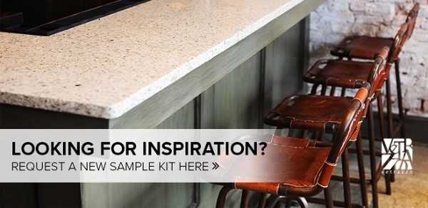
Before you pick your paint, dive into some more color inspiration. Samples are free to the trade. Order yours here.