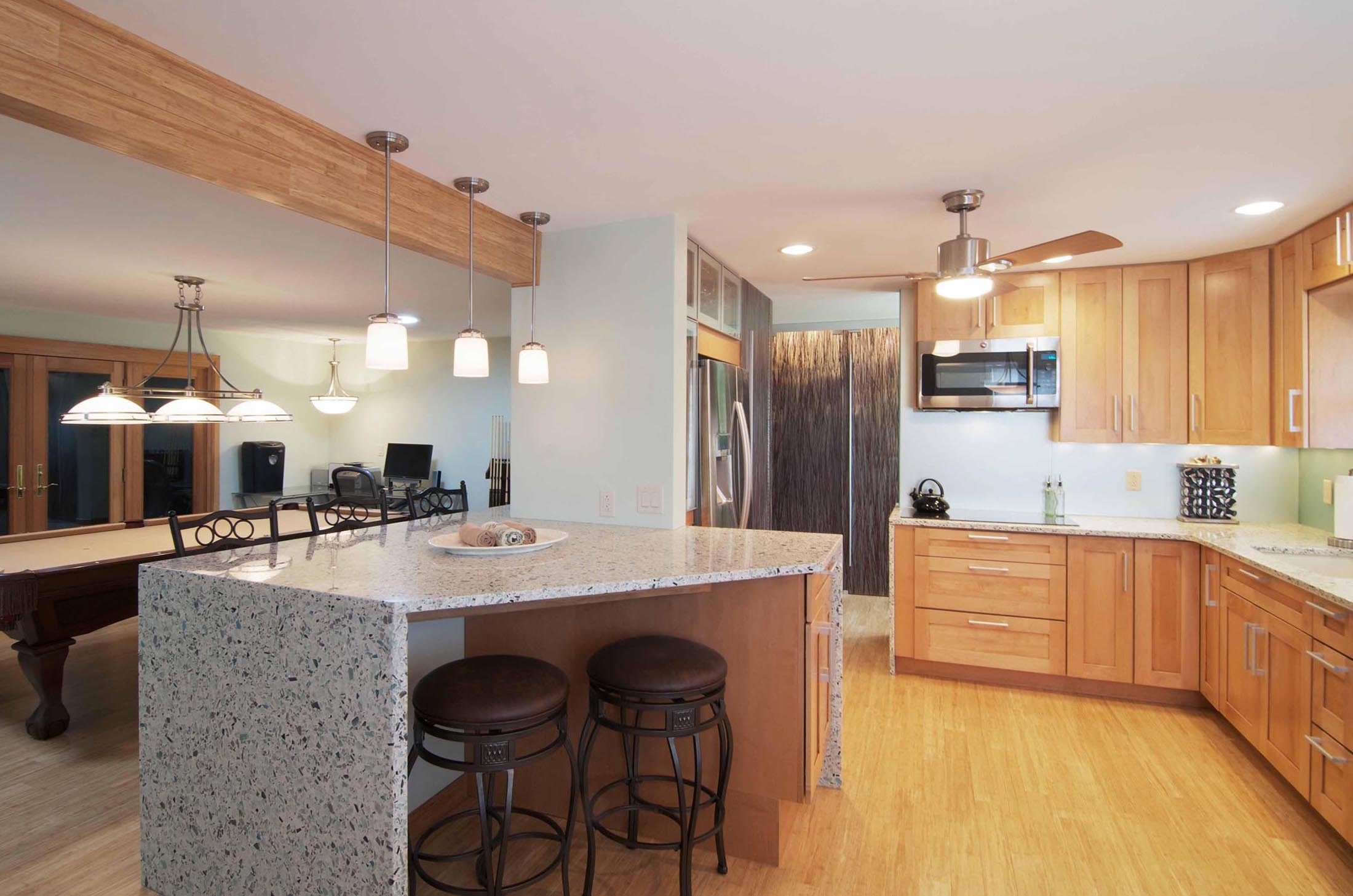
At first glance, you’d never be able to guess that this spacious, bright and airy kitchen was once a set of small and cramped rooms. Closed off, constricting and divided by partition walls, the four medium to small spaces were in desperate need of an update for both style and function.
Designer Jereme Smith of DII Architects had a vision for the 60s-style ranch home that involved an overhaul of the current floorplan, plus, a total gutting and replacing of nearly every surface in the kitchen and dining area for an almost blank slate. The design in mind was not just to update the space but to weave in modern and eclectic touches that would better fit the Illinois homeowners’ style and give them more room.

With dividing walls torn down, this kitchen now has room to breathe and entertain.
To achieve this, Smith and his team added features that made the kitchen feel more streamlined and visually bigger, even if it was somewhat of a trompe d’oleil. “A goal with the new layout was to stretch and link spaces within the home”, said Smith about their approach to the renovation. Put simply, it wouldn’t be enough to just knock down a wall and add a fresh coat of paint. Instead, it was about bringing a better sense of cohesion and movement to the kitchen, dining area and foyer through strategically placed design elements.
Smith and his team added a spacious central peninsula that doubles as a breakfast bar where a wall used to be, plus, a 10 foot wooden beam above the surface to draw the eye upwards and create the more raw, natural texture that the homeowners loved.
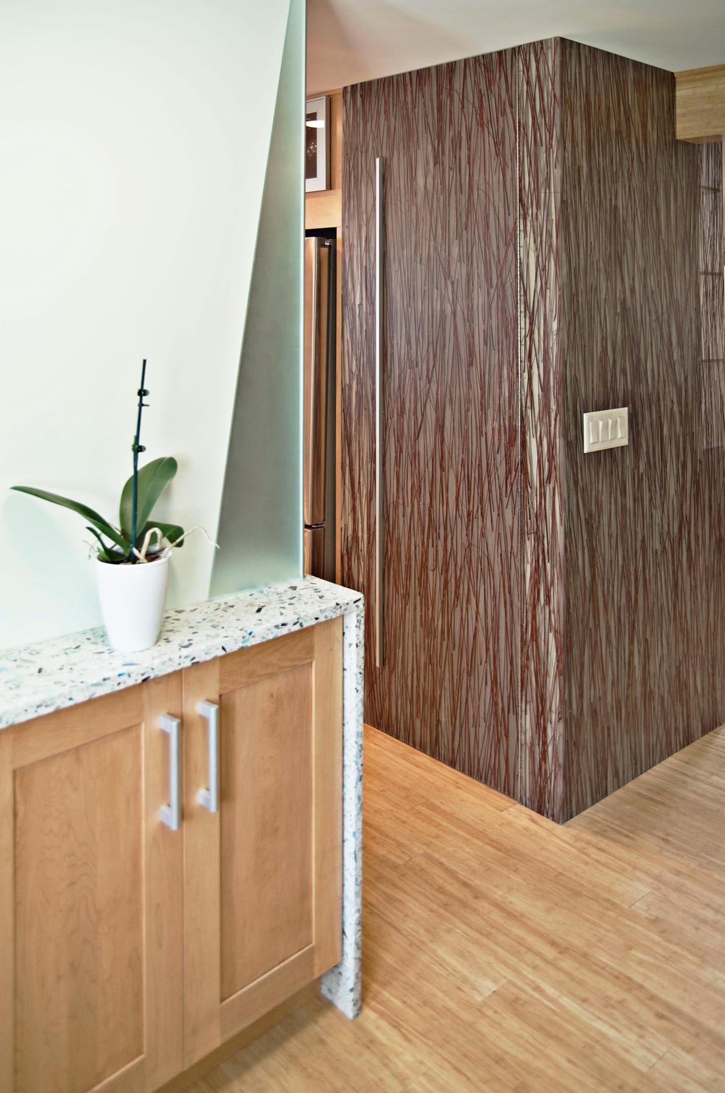
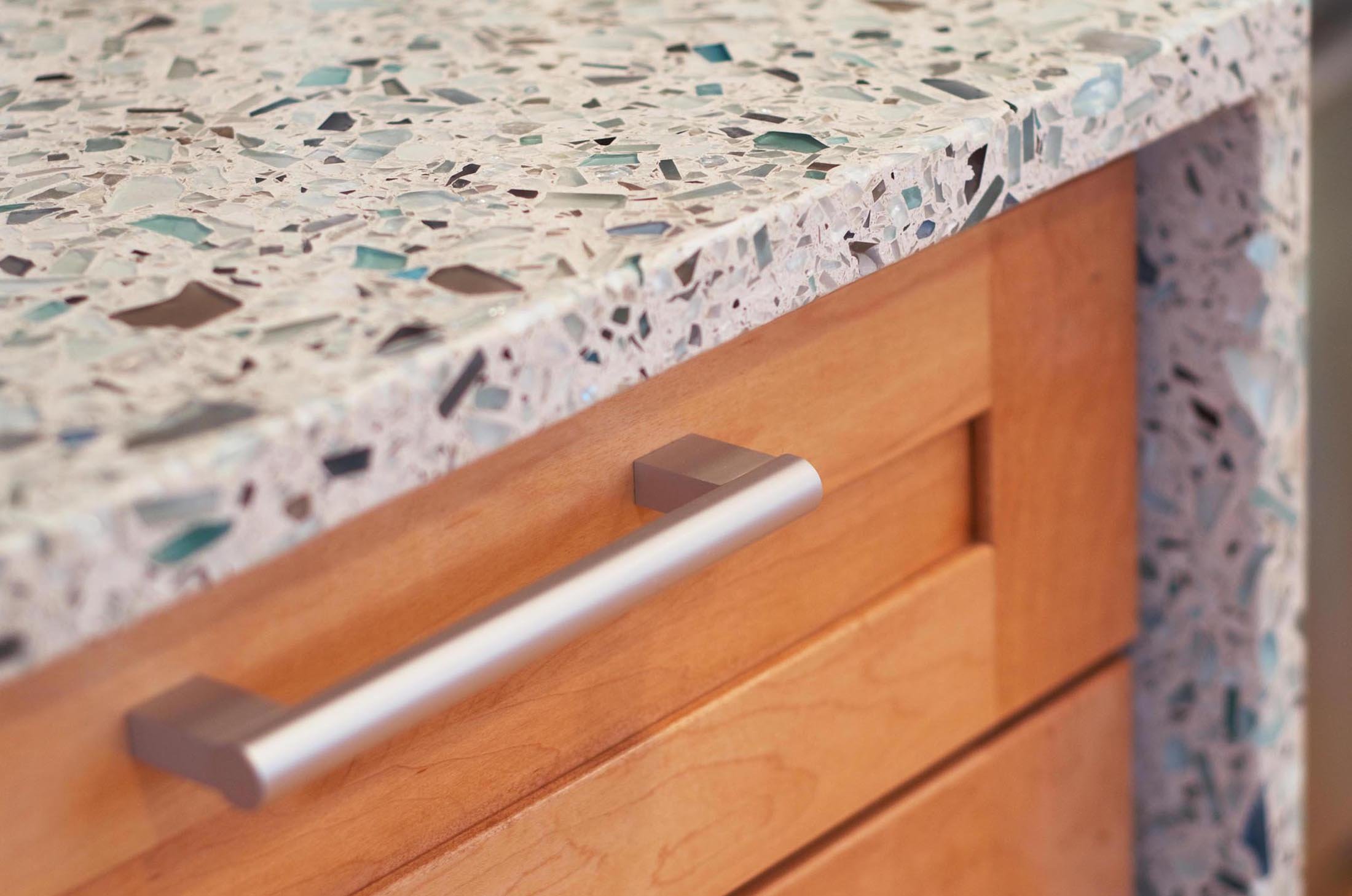
Yet, what really made an impact were the counters. Midwest Fabrication installed sparkling blue-green Palladian Gray Vetrazzo recycled glass countertops throughout the entire kitchen, highlighting Smith’s clever design choices. The sea glass style countertops wrap around the main area, the central island/breakfast bar, and even into a functional ledge in the foyer with each corner cascading into a beautiful waterfall edge.

“The most innovative component of these countertops is the subtle five degree angle in conjunction with the vertical waterfall elements,” Smith said.
In a genius design move, Smith and his team also designed the counters to taper in and grow wider to both visually and physically create a better line of sight and flow between the four adjoining rooms.
“The owners were hoping to open things up for more light and connected spaces,” he said. “They needed a highly functional, efficient and beautiful kitchen. This technique doesn’t necessarily create space as its main goal. The idea is that it works as efficiently with the existing space as possible while aiding flow and functional storage.”

This functional ledge in the foyer is actually part of the countertop surrounding the kitchen range on the other side of the wall.
In addition to creating the space and storage they craved, the homeowners were committed to being environmentally conscious during their kitchen renovation by purposefully selecting eco-friendly materials for the project. For that reason, they incorporated elements such as Energy Star appliances, 3-form grass infused with eco-resin panels, bamboo wooden floors and of course, the Vetrazzo countertops, which utilize recycled glass. The recycled glass pieces are hand-placed inside each countertop to give it greater depth, a sense of craftsmanship and playful inner luminosity — something the couple appreciated.
Because Vetrazzo owns and operates its own atelier in Georgia it has the freedom to custom tailor slabs for each customer's needs, including ultra-thin profiles of 1 cm, pour-to-size and even a tweak to the color mix.

Each Vetrazzo slab is a result of the work of eight craftsmen and incorporates 576 lbs of U.S. post-consumer recycled glass pieces, predominantly sourced from domestic curbside recycling.
“The owners had a few light teal display pieces and just loved the blue, grey and green tones of the Palladian Gray,” Smith said. “We actually asked for a 15 percent increase in the blue and green glass. The final product exceeded expectations!”

The waterfall edge on this perimeter counter serves as an artful feature in the kitchen banquette.
Since there’s really no better way to bring natural elements into a space than by actually bringing the outdoors in, the open area now basks in a generous amount of natural sunlight. Thanks to a south-facing window, light comes streaming in and brings to life the dynamic composition of the Vetrazzo’s reflective glass pieces. “Throughout the day, the south and west facing windows allow amazing natural light to animate the counter,” Smith said. “It sparkles and reflects differently all day...usually revealing a new glimmer at every visit.”
Smith said, the project to turn this disjointed house into a cohesive home was a labor love that was worth the effort. “The clients are very happy with how the architecture fits them and not the other way around.”
Want to add an artisanal touch to your home? Order a sample of Vetrazzo’s Palladian Gray, here.


