If you love a neutral but feel numbed out by white quartz or bored by beige granite, do not give up hope for your kitchen or bath design.
Neutrals don’t have to be a palette of tired and boring beige, uninspiring grays or stark whites. With a little sparkle and some inner luminosity neutral surfaces can be the centerpiece for designs layered in visual texture, even as they hold back on bold color.
A combination of different recycled glass, each slab is thoughtfully and meticulously handcrafted. Designed to stand out and blend in, these countertops have a beautiful ombre effect and a monochromatic look that makes them seem like a true neutral. However, a closer inspection will prove that a Vetrazzo neutral still has pops of colors and tiny details that provide visual interest to keep things from ever getting boring.
So, to help you pick your perfect piece, here are five of our favorite non-boring neutrals.
FAIR PEARL
![fair-pearl-neutral-recycled-glass-counters[1]](https://blog.vetrazzo.com/hs-fs/hubfs/Imported_Blog_Media/fair-pearl-neutral-recycled-glass-counters%5B1%5D-1.jpg?width=400&name=fair-pearl-neutral-recycled-glass-counters%5B1%5D-1.jpg)
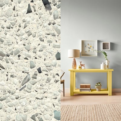
An alluring combination of neutral gray hues and warm blush tones, the Fair Pearl countertop instantly adds a subtle splash of color and charm to your kitchen or bath. Designed in collaboration with Laura U, the materials are all sourced from recycled glass and mother-of-pearl to give your space a chic and sophisticated look with a relaxed beachy vibe. A soft and romantic pearly iridescence balances out the hard, clean lines of the masculine gray glass pieces making it a truly neutral piece with just the slightest hint of color. Fair Pearl pairs great with trendy rose gold accents and classic wood furniture, making this a neutral surface that will endure the evolution of style. See more in this kitchen.
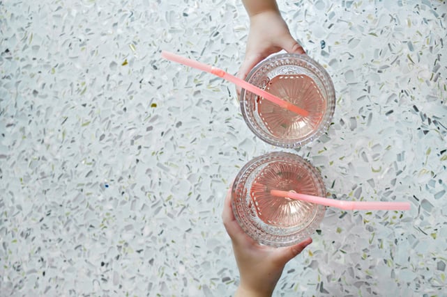
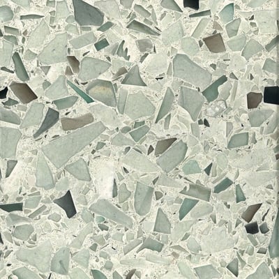
Cubist Clear
When we say neutral, we never mean boring. The same can be said about our Cubist Clear countertop crafted from a mix of recycled tempered glass in shades of gray, brown, black and beige. It’s cool and muted color palette makes Cubist Clear an ideal backdrop for other bolder and brighter accents with plenty of visual interest of its own. Artfully constructed out of an artistic arrangement of square shaped glass, you can even let Cubist Clear stand alone as a subdued centerpiece that, when seen up close, is dynamic but never busy. This not-boring-neutral piece gives you the freedom to be a little more playful and daring with your design choices. This recycled glass mix is a fresh, clean canvas for your space with a multi-faceted sparkle.
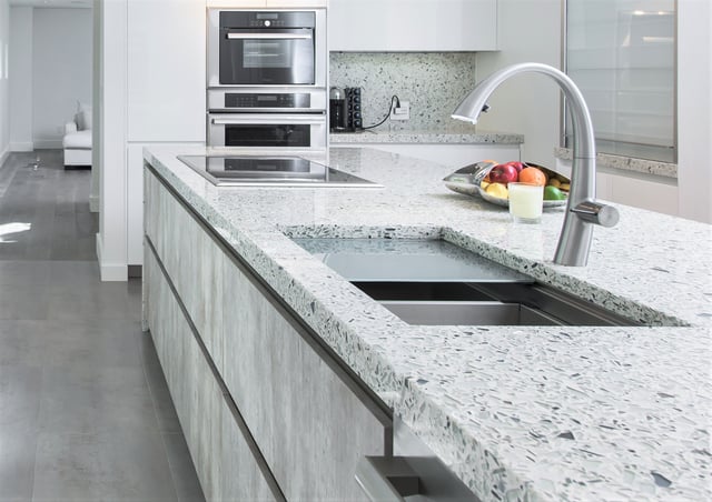
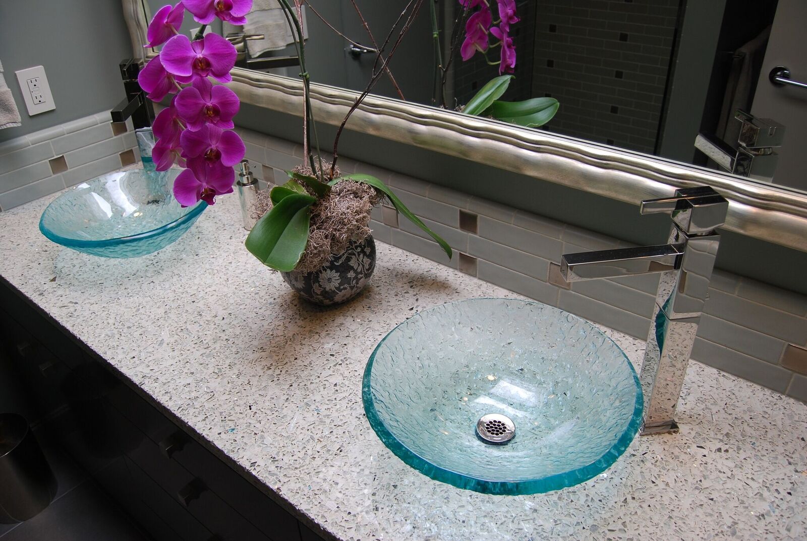
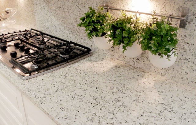
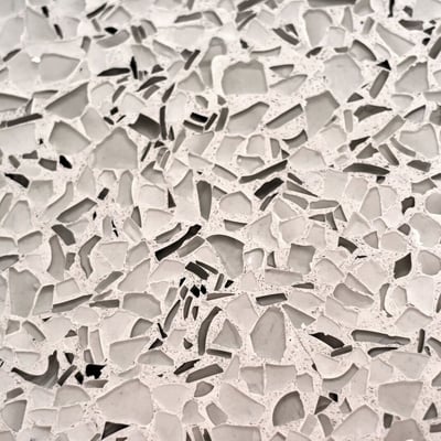
Umbo White
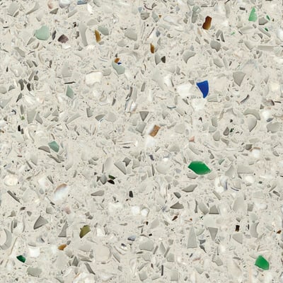
Umbo White’s warm, creamy tones and natural, earthy hues come from the recycled oyster shells and pieces of white marble from Polycor’s Georgia marble quarry embedded within it. The chips of marble used in the slabs add another level of texture while also making use of smaller pieces of stone from the quarrying process. What truly distinguishes Umbo White from a boring off-white countertop are the tiny details within. Small pops of blue and green are thoughtfully placed, or “seeded”, by hand throughout the surface as if it were found pieces of seaglass that had washed up on shore. (In fact, no two slabs of Vetrazzo recycled glass are exactly alike.) When paired together the complementary backdrop of rich oyster shells and marble chips with the pop of vibrant greens and blues allows both materials to shine.
Palladian Gray
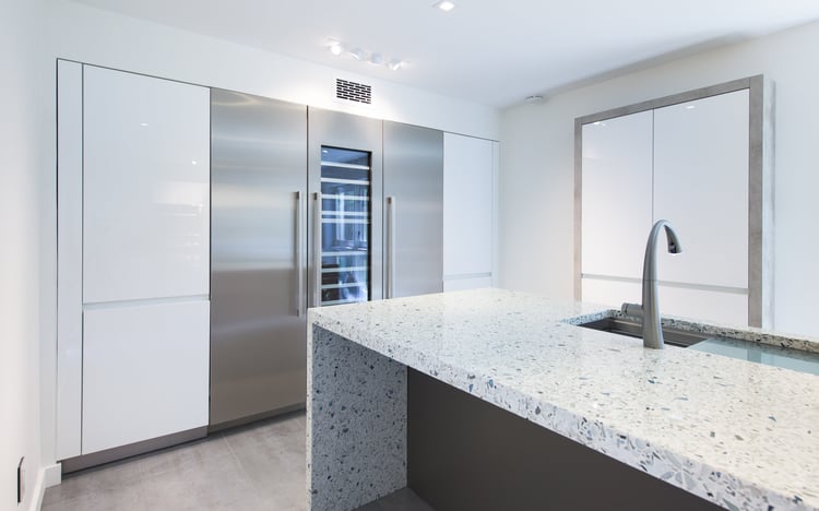
Embrace neutral’s cooler side with soothing shades of gray, white and the occasional hint of blue glass for just the right amount of movement and texture. The Palladian Gray mix is crafted from clear architectural demolition glass (its name being an homage to the prolific Italian architect, Palladio) and is a design-forward pick in its own right.
Proof that a little can go a very long way, this tonal gray palette gives your space an airy and elevated feel that’s chic and sophisticated all at once. What we love about Palladian Gray is how it’s neutral hues anchor a kitchen or bath but still stands out with a crisp and clean aesthetic that’s modern without being too stark. A combination of larger glass shards paired with dashes of smaller, darker pieces is what sets this color apart from other white surfacing. When you want to go for a soft luxe look and add dimension to your space, go for Palladian Gray.
Martini Flint
A modern classic (in the making), every Martini Flint slab is crafted from pieces of recycled clear glass bottles and jars set into a white backdrop for a truly unique take on the neutral. Fresh, bright and elegant, the Martini Flint’s stunning combination of white and glass is never cold — we suspect its warmth comes from the inner luminosity of the glass pieces that catch and throw light to give it instant body and depth. See how one designer used this surface for a kitchen, bath and hearth in a beach house. The hand-placed glass pieces capture the purity of glass without looking too pristine. The subtle differences in each tiny piece give it character and texture. And you may find the occasional blue or green piece placed like an olive in it’s namesake cocktail. A truly versatile material, Martini Flint is a focal point, conversation piece and foundation all in one. We’ll take ours straight up, please. One for the bar and one for the bath...
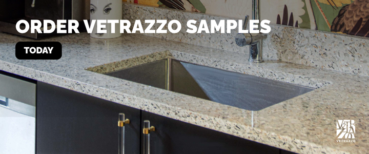
See our Vetrazzo neutrals and discover even more options by ordering your samples today.