Countertops are a commitment. Choose one that invokes your passion and you’ve got an investment that will continue to deliver inspiration for decades to come. But even favorites can use a refresh from time to time. Whether your Vetrazzo recycled countertop is a kaleidoscope of color or a sublime neutral, you can bring a new feeling to your space by adding a wall color that brings out one of its unique tones.
Each summer the top paint brands roll out their new colors and palettes for the following year. If that seems like putting out the Christmas decorations in August before the kids have gone back to school, we would agree. But what that long lead time does is give designers and bloggers plenty of time to play around with their new paint boxes - and that means more design ideas for you and your home.
See how some of the coming year’s colors accentuate and complement the color mixes of our recycled glass countertops.
Benjamin Moore
Metropolitan AF-690
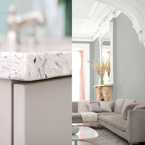
Ben Moore’s Color of the Year 2019 – Metropolitan AF-690, is a chic soft gray with cool undertones. Benjamin Moore Director of Strategic Design Intelligence, Ellen O'Neill calls Metropolitan AF-690, "comforting, composed and effortlessly sophisticated. A color that exudes beauty and balance.” A quiet hue, we think it makes an excellent pairing for neutral recycled glass mix Umbo White, made from recycled glass jars, Georgia marble and South Carolina oyster shells.
See a serene Umbo White bathroom here.
Sherwin-Williams
Cavern Clay SW 7701

A warm terracotta color with ancient, elemental roots, the brand calls Cavern Clay a nod to midcentury modern style, but with the soul of the American Southwest for a desert modern aesthetic. Designer Kristin Jackson, the Editor + Hostess in Chief of Hunted Interior, says she could see this color trend emerging in fashion. She used Cavern Clay to create an art piece on a living room screen.
“The warmth of this hue radiates off of whatever it is painted on. Its natural tones look great paired with blush pinks, greens, and deep blues. Basically, anything that looks beautiful planted in a terracotta pot would make a lovely color companion to Cavern Clay!” See more on her project here.
We love the warmth of Cavern Clay paired with the dynamic character of Martini Flint, a recycled glass countertop mix that’s neutral, but never boring. This translucent mix is made with clear glass bottles and condiment jars.
"Sun-washed and warm, this palette can be seen in the baked clay canyons, worn leather and woven wool blankets," writes Sherwin-Williams in a blog post. The Wanderer palette has subtle earthy colors with a pop of deep blue.
See a serene and soothing Martini Flint beach house here.
Farrow & Ball
Inchyra Blue 289
Inspired by a bespoke color made for Lord & Lady Inchyra at beautiful classic Georgian Inchyra House in Scotland, Farrow and Ball’s new blue is a mellow, moody hue. Inchyra Blue (pronounced with a ‘ch’ as in China) has depth and presence like the dramatic backdrop of Scottish skies.
Depending on your exposure and time of day, Inchyra Blue can read grey, or even green. We like it’s dynamic nature as an alternative to grey. Paired with the striking mix of architectural glass in Palladian Grey, Inchyra will create a look that continually evolves as the quality of light in your space changes throughout the day.
a tiny dark kitchen transformed with Palladian Grey.
Sherwin Williams
Elation SW 6827
Part of the Shapeshifter palette from Sherwin Williams, Elation is as dreamy and amorphous as a cloud. You’ll love how it perfectly adapts to and complements your existing furnishings.
For a soothing combo we’d match Elation with Amethystos, our mix made with Georgia marble chips, South Carolina oyster shells and gorgeous purple glass. (For maximum punch we like it paired with Vetrazzo by Laura U’s Orchid Reflection which incorporates bits of purple artisan glass and mirror into its surface.)
See an Amethystos bathroom here
Behr
Blueprint S470
The 2019 Behr Color of the Year, Blueprint, is an honest, approachable color that conjures up the blueprints that builders rely on to bring architectural designs to life. Blueprint creates a space where you can build your own reimagined life-—where awareness of what we want to build for ourselves can transform into action.
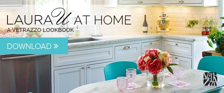
We love it paired with our Fair Pearl for a warm, welcoming space. One of our newest colors from our Designer Collection by Laura Umansky, this color mix includes mother-of-pearl pieces for a soft neutral with a hint of pink. See the designer’s own kitchen featuring Fair Pearl.
Adding these colors to your decor is less about being trendy and more about adding fresh air to a space you already love, especially if you’ve got a Vetrazzo countertop that sparkles with that inner luminosity. A countertop made with 100 percent recycled glass is an enduring way to add color, sparkle, and interest to any kitchen, bath or living, no matter what the trends are doing.
See how designer Laura Umansky uses Fair Pearl recycled glass in her kitchen. Download the lookbook.